Bossygreg Builds a Website
for the NYC Boutique VERVE
There is an amazing women’s shoe and accessory boutique in the heart of the Manhattan’s West Village on Bleecker Street and it is called Verve. Not only is the merchandise unique, interesting, cosmopolitan, and reasonably priced but the owners and staff are extremely knowledgeable both about their products and the latest styles and upcoming trends—just lovely, down-to-earth, brilliant people.
Verve’s Original Website
Verve has had the same website for almost 10 years. The website has served them well. It is vibrant and makes use of Verve’s signature green. There is a menu bar adorned with vector foliage, an opening flash animated index page, and a horizontal scrolling image bar featuring shoes and accessories. It’s a good site.
But times they are a changing. The word du jour of 2014 is simplicity; clean lines and scannable content.
The Direction
When I spoke to Wendy, one of the owners of Verve, I shared my vision of an almost minimalist website that uses their signature green as an accent instead of serving as the focal point. I also wanted to give them an area on the website where the store managers could upload pictures of new merchandise and post the latest sales announcements without having to rely on a webmaster. Wendy was all for it but very clear that Verve is a brick-and-mortar establishment and although they will take orders and ship anywhere, they are not capable of being a true e-commerce site. They prefer to communicate in-person or over the phone. So the sales area of the website could not be a true interactive blog. I would have to disable the comment feature.
After discussing the look, the feel, and the purpose of the site, we discovered we were in sync. Wendy then said she trusted me completely and that when she returned from the Milan tradeshows in 5 days, we would launch the site. How great is that?! Carte blanche, baby!! That doesn’t happen every day. It’s a huge responsibility to define a brand and execute it, especially in the given time frame, and I wasn’t going to let Wendy or Verve down.
The Layout
The goals of the site are to emulate the feel of the boutique and pass along pertinent information, the newest merchandise arrivals, and upcoming sales to the customer while keeping the number of menu items on the navigation bar to a minimum and all body copy scannable. People do not read anymore, especially on the web. We scan text and scroll by images. Here’s what I proposed:
- A one–page WordPress content management system website with an attached non-interactive blog for sales, news, and photos. I chose WordPress since they have the lion’s share of the CMS website-building market and they have an excellent support/forum system.
- The landing page would be a full-width parallax slider with the images cycling at 4–second intervals.
- In addition to the Sales/News area, there would be 3 subsections with corresponding menus on the navigation bar: About Verve, Our Reviews, and Contact Verve.
- In between each subsection would be well-known fashion quotes.
- The background color would be white (#fff)—clean and crisp.
- The fonts would be web-supported: Oswald (headers, titles, home parallax), Allura (accent text on the home parallax only), and Arial (body text)—clean, easy to read.
- The colors would be black (#000), white (#fff), Verve’s green (#7bc608), and Verve’s burgundy (#712504).
- The contact subsection would have information for both customers and designers plus an interactive Google map.
Parallax
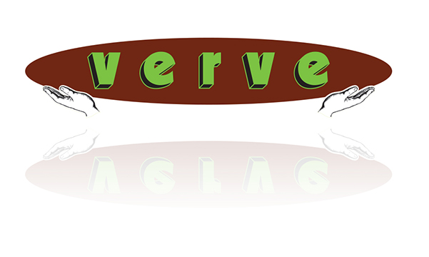
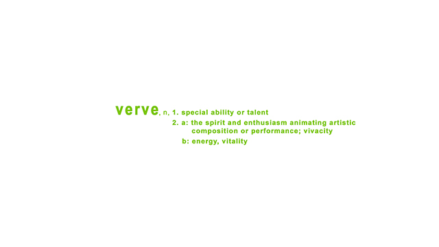
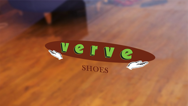
Verve has a terrific logo—simple with complimentary colors. It was created by a friend of mine at the conception of Verve. As they say, if it ain’t broke . . . The website was to have a full-width parallax slider as the landing page and it would be the perfect place to showcase the logo. I decided that there should be four slides on the parallax. The first slide would consist of the logo on a white background with a gradient reflection. The second slide would be the dictionary definition of the word verve in their signature green. The third slide would be a photo of Verve’s logo on the store’s front door. And the last slide would be an Adobe Illustrator rendering of Verve’s storefront.
Creating the first two slides was easy–peasy. The third slide was a little trickier. The photo of the front door was quite a small file and I needed to make it almost 2,000px wide to accommodate the slider. So in Adobe Photoshop, I removed the pixilated logo from the picture, rebuilt the inside view of the store, slapped a Gaussian blur on it to simulate a reflection, and skewed the logo to match the angle of the original photo.
The last slide was also tricky in that I did not have a clear photo of Verve’s storefront. All of the photos that I was given of Verve were taken at an angle and not straight–on. I searched Google maps street view but the angle was off as well. With Wendy in Italy and me in Kalamazoo, I didn’t have many options. So what did I do? I called a friend in NYC and had him go down to Verve. While we were on the phone, I instructed him in how I wanted the shots to be set-up. It worked beautifully. He would take several photos, email them to me, and I would give him adjustments. Fortunately, he has the patience of a saint. The illustration was fun to create and really only took 15 minutes. I kept the green/burgundy colors true to Verve’s brand but I used pastel colors on the building and windows. I wanted to invoke a Parisian–feel to the piece. I think it’s quite sweet.
About Verve Subsection
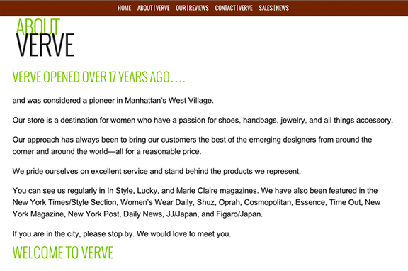
The About subsection would be the boutique’s description. I took the existing body copy and reworked it to codify the ideas, reduce the number of words, plus I broke it into digestible sections with a header hierarchy. I would have preferred to condense it down even more, but Wendy was happy with the rewrites and didn’t think it needed more streamlining.
Our Reviews Subsection
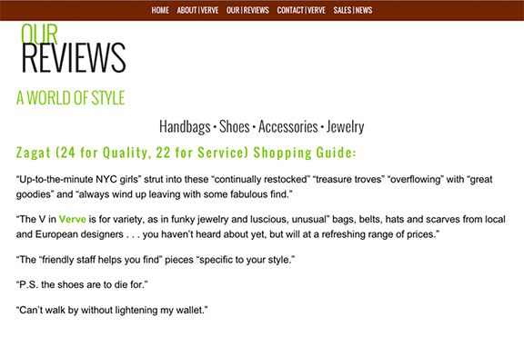
The Review subsection consists of direct quotes from their excellent Zagat customer reviews. There wasn’t much need to do anything except create a headline and breakdown the reviews into sound bites—pretty straightforward.
Verve Contact Subsection
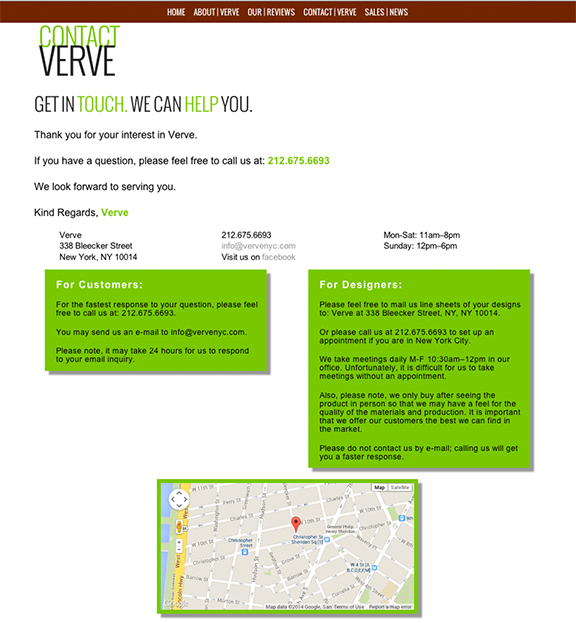
Since Wendy preferred not to have a form section on her contact page, I created a Contact subsection rather than use the built in WordPress contact template. I created a series of class and ID div tags to hold the address information and separate sections of contact instructions for customer and designers. I also included a Google map of Verve’s location plus a link to Verve’s Facebook page.
Fashion Quotes
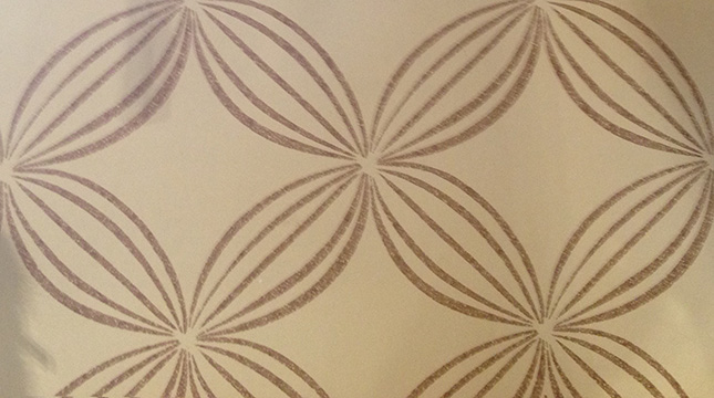
While my friend was taking pictures of Verve’s storefront, I had him take a picture of Verve’s wallpaper. The last time I was in Verve, I remember liking the wallpaper on their accent wall and thought it would make a nice background for the fashion quotes. Once I had the photo, I recreated the wallpaper in Adobe Illustrator in 5 minutes. I played around with the darkness of the pattern. I wanted it to be as subtle as possible but still be seen on multiple devices. Older devices have a difficult time with light images. I chose Coco Chanel fashion quotes for the website. Coco’s clothing designs were minimalistic, elegant, and timeless plus she was quite charming. Here are the quotes I selected:
- Fashion fades, but style endures.
- Dress shabbily and they remember the dress; dress impeccably and they remember the woman.
- A girl should be two things: classy and fabulous.
SEO
I applied a couple of SEO (search engine optimization) plugins to the Verve website. I labeled and described every element so as to make the Verve site highly visible, easily searchable, and uniquely labeled for multiple web browsers.
Evaluation
The planning, layout, creation of the components, web coding, and the assembly of everything took very little time. I spent the majority of my time just looking at the website and experiencing it. Did it accomplish the set goals? Was it elegant but not too sparse? Did the translation of concept to execution match up? Is the site experience intuitive and simple with very little incidence of user error or coding failure?
I’ve checked the entire website on multiple devices: new 2013 27” iMac, an older iMac, a G5, an iPhone, a Samsung Galaxy, an iPad, a Del PC, and a MacBook Pro. As well, I tested the website on the following browsers: Google Chrome, Mozilla Firefox, Safari, and Internet Explorer. All seems a go!
I also created a step–by–step guide for Verve on how to post information, label files, format images, create galleries, and some easy, basic CSS/HTML.
Feedback
When Wendy returned from Italy, we went through each element and section over the phone. She loved her new website! Wendy’s only requests were to make some changes to labels and some minor text updates. That was it!
Overall, I am quite pleased with the website and I couldn’t ask for a more agreeable situation. I think the website will serve Verve well and will be easy to modify as their needs change. Stop by and visit the site at vervnyc.com or better yet, stop by the boutique and say hello. You never know, you might find a little treasure for a loved one (or yourself). At the very least, you’ll meet some terrific people and see some beautiful bags and accessories.
Peace, my friends




Recent Comments